
REWARE
REWARE
A sustainable fashion app empowering users to shop consciously.
-
Conceptual
-
3 Weeks
-
UX/UI Designer
-
UX/UI Design
User Research
-
Figma
Procreate
Sketch

The Problem
We all know sustainability is a big deal now—but actually shopping sustainably? That’s still messy. The online fashion space is full of greenwashing, vague promises, and hidden supply chains. Even if you want to make good choices, it’s exhausting to dig through all the noise.
Most platforms also stop at just selling. Very few integrate circular fashion practices like recycling, swapping, or educating users on how to reduce waste. And when it comes to sizing, inclusivity is still an afterthought—leaving many people unsure if something will fit or feel right.
So I focused on three problem areas:
Introduction
Reware is my take on what sustainable fashion should feel like: simple, inspiring, and fun.
I designed it as a conceptual platform that curates only sustainability-focused brands (yes, all vetted before they’re even allowed on the app), so users can shop with total peace of mind. The experience is clean and modern for both desktop and mobile, but it’s also warm, engaging, and peppered with ways to learn, swap, and reduce waste—without it ever feeling like homework.
From the start, I wanted to blend thoughtful UX with visuals that feel bold but human—something that encourages good habits while making users feel like they’re part of something bigger.


Project Goal
My aim with Reware was to:
Give users an instantly trustworthy, fully vetted shopping environment
Make reducing waste and swapping clothes as easy and enjoyable as buying something new
Create an inclusive experience that celebrates all body types
Encourage mindful fashion habits without feeling preachy or restrictive
It’s not a commercial launch—more of a design playground to explore how UX can make sustainable fashion more accessible, educational, and downright enjoyable.
Research
Since this was a conceptual project, I leaned on secondary research to get a sense of real frustrations and needs in the sustainable fashion space.
I dug into:
Competitor platforms (mainstream and niche)
Reddit threads and online fashion communities
Trend reports on circular economy and slow fashion
Customer reviews highlighting sizing struggles, lack of trust, and missing recycling options
From this, I created two provisional personas—each with their own goals, pain points, and a little quote to keep their voices in my head while designing.


Competitive Analysis
I wanted to know: what’s already out there, and where are the gaps?
So I audited ASOS, Vinted, ThredUp, and Depop—looking at how they handle sustainability, recycling, sizing, transparency, education, and community.
Key observations:
ASOS nails the polished shopping experience but sustainability feels like a filter, not a core value.
Vinted and Depop are great for resale but leave users to figure out sizing and sustainability on their own.
ThredUp integrates recycling well but still feels transactional and not very engaging.
The takeaway? There’s space for a platform that’s:
Fully vetted and trustworthy by default
Packed with fun, waste-reducing features
Educational in a light, engaging way

Key Features
Reware blends shopping, swapping, and recycling into one experience, designed to make sustainable fashion simple and rewarding.
Curated Brands Only
Every item comes from a pre-vetted sustainable label, removing guesswork and building instant trust.
Swap Closet & Tracker
Users can list clothes to swap, track exchanges, and celebrate successful swaps with clear next steps and visual confirmations.
Inclusive Fit Tools
Filtering by proportions and storing body measurements makes it easier to find clothes that genuinely fit, supported by a body type matching system.
Recycling Made Simple
Recycling options are built directly into the profile, with step-by-step guidance for sending off old garments.
Educational Moments
Fun, bite-sized facts about materials and sourcing appear naturally on product pages, turning shopping into a chance to learn.
Ideation & Design Strategy
From there, I mapped out an app that’s easy to navigate but still feels rich in features. The architecture revolves around four main hubs:
Home – curated collections, seasonal picks, and quick access to swaps or recycling
Brands – deep dives into vetted sustainable labels
Top Picks – my “editor’s choice” of standout sustainable finds
Recycling – garment recycling made simple, plus swap options for a more playful approach to circular fashion
Profile pages (private and public) let users track their swaps, store body measurements for better fit suggestions, celebrate achievements, and see their positive impact.
The black blocks in my IA are main pages; the blue blocks are the ones I took into full visual design.

Low-Fidelity Sketches
I began with quick sketches to ideate on possible layouts and flows. These sketches helped me rapidly explore navigation structures, swap mechanics, and the balance between community and recycling features. While rough, they acted as stepping stones toward more structured wireframes.

After narrowing down the most promising ideas from these sketches, I translated them into wireframes to refine the structure and user flow.


Home Screen
Act as the central hub for discovering content and navigation.
Promote sustainable shopping through banners and calls to action.
Provide clear “Shop by Category” access for quick browsing.
Brand Browser Screen
Allow users to explore brands that meet specific sustainability criteria.
Include filters and brand summaries to support informed decision-making.
Maintain visual consistency with other product browsing flows.
Top Picks Screen
Showcase seasonal sustainable selections to inspire purchases/swaps.
Prioritise curated content over general browsing to help users decide faster.
Create a feeling of exclusivity and timeliness.
Item Exploration & Purchase Flow
This flow optimises product discovery and decision-making. Users can filter by size, colour, and material, and enter body measurements for tailored recommendations. Detailed product pages present sustainability information alongside purchase or swap actions, empowering informed decisions.
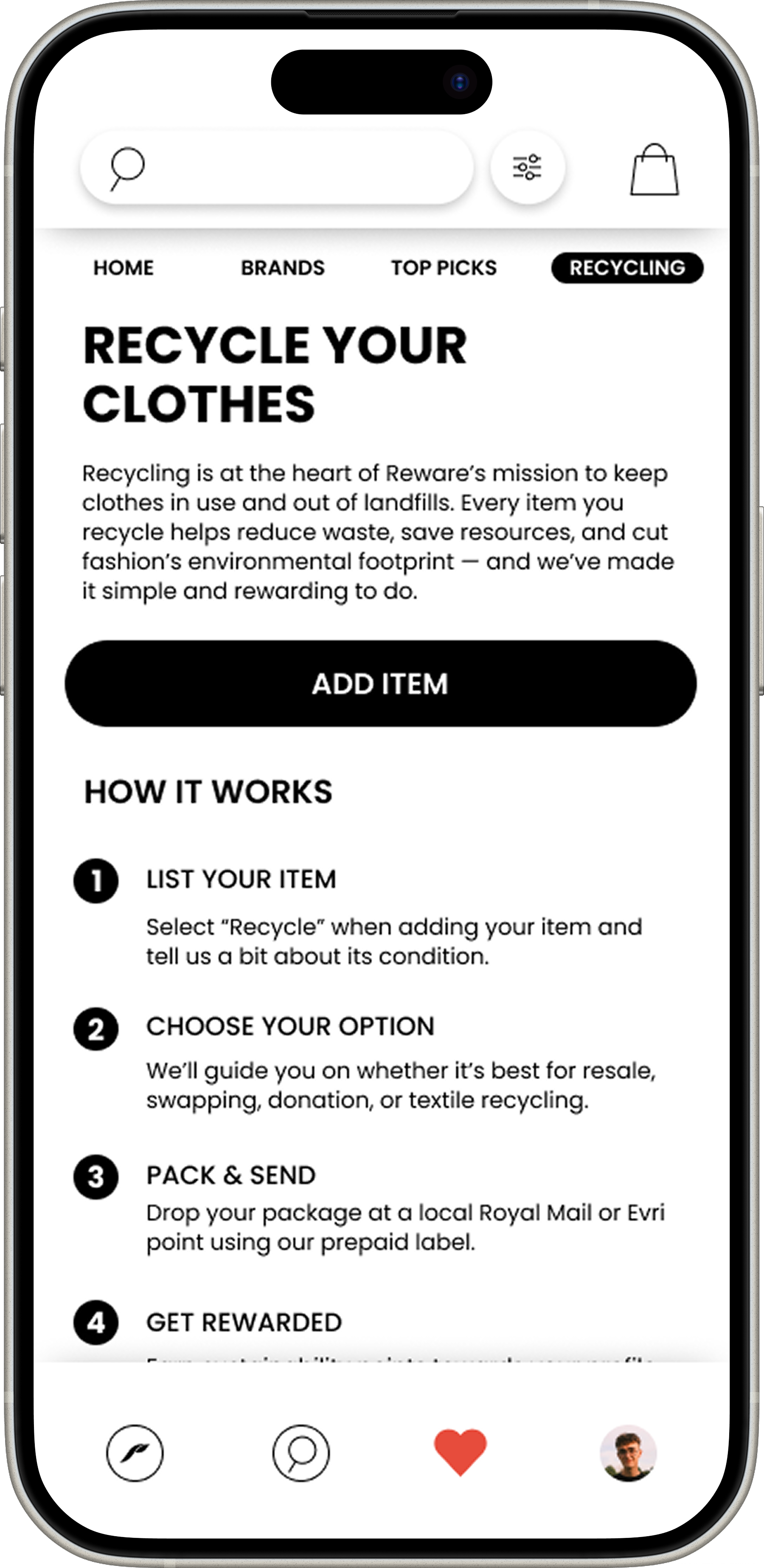
Recycle Screen
Educate users on the recycling process with a simple “How it Works” breakdown.
Provide a clear “Add Item” action to encourage participation.
Build trust by explaining eco-benefits and recycling partners.
Wire Frames
Core Navigation & Home Experience
The home experience is designed to immediately connect users with sustainable fashion choices. Clear visual hierarchy guides them toward browsing by category, exploring curated picks, or viewing sustainable brands. The consistent hotbar provides easy access to core features from anywhere in the app


Item Information Screen
Present essential item details (size, price, description) above the fold.
Make size selection and adding to bag/swaps quick and prominent.
Include sustainability and care details for eco-conscious decision-making.

Profile Screen (Private)
Give users quick access to key personal areas like Swap Closet, My Impact, and Orders.
Prioritise navigation for personal management rather than public interaction.
Keep a consistent layout to make it easy to switch between private and public views.

Profile Screen (Public)
Showcase the user’s public identity and achievements for social trust.
Include a verified badge to support credibility and encourage swapping.
Allow easy navigation to their Swap Closet without exposing private details.
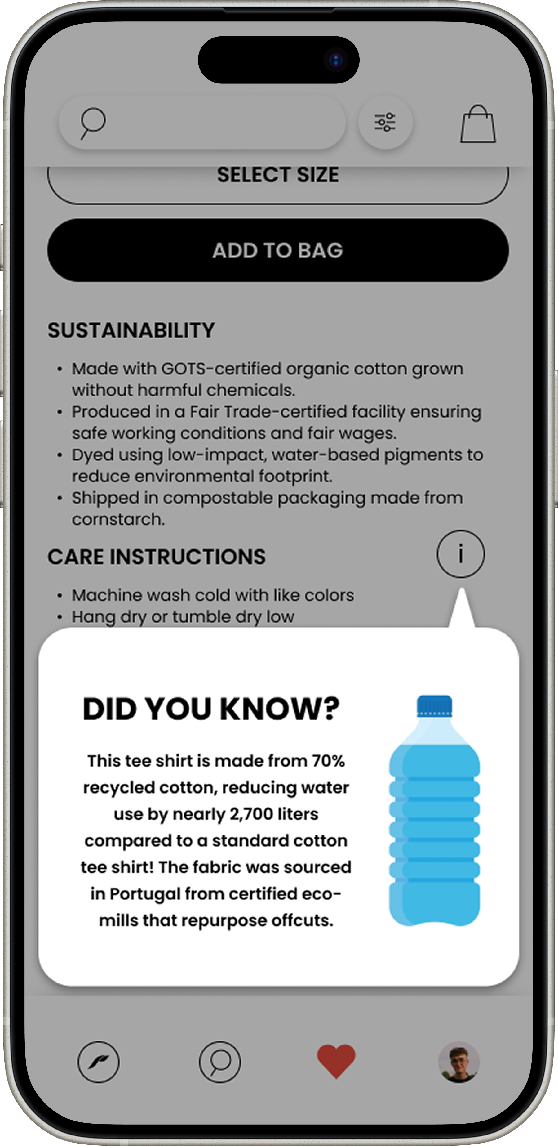
Item Information (Extended)
Expand on product sustainability, care instructions, and materials.
Give shoppers confidence by being transparent with product data.
Maintain a consistent format with other product detail pages.
Swap Journey, Community & Communication
The swap flow enables users to exchange items directly with others, reinforcing the app’s sustainability mission while fostering meaningful connections. Built-in messaging strengthens trust and makes swaps more personal, with clarity-focused conversations that keep key details accessible. Profiles showcase personal swap closets for discovery, while the tracker keeps users informed about progress. Clear success states celebrate completions and encourage continued engagement.

My Impact Screen
Visually show the positive sustainability impact the user has made.
Use achievement badges to gamify eco-friendly behaviour.
Support the brand’s environmental mission through engaging metrics.

Chats Screen
Provide an overview of all ongoing conversations.
Show message previews and activity indicators for prioritisation.
Encourage community and trust-building through personal messaging.
Filter Screen
Allow users to refine searches by body type, colour, and materials.
Make filters collapsible to reduce clutter.
Ensure the filtering process feels smooth and non-intrusive.
Swap Closet Screen (Private)
Provide a visual overview of items ready for swapping.
Highlight key actions like “Swap Tracker” and “Add Item” to encourage engagement.
Maintain a clean grid layout for quick scanning and item recognition.

Message Screen
Enable real-time swap negotiation and coordination.
Use a clear text bubble format for easy reading.
Include quick actions like viewing the swap item or partner profile.
Body Measurements Screen
Help users set accurate size profiles for better swap matches.
Use visual sliders to make adjustments more intuitive.
Reduce swap errors and returns by improving fit accuracy.

Swap Confirmation Screen
Celebrate a successful swap with clear “what’s next” instructions.
Provide both action options: exchange location or direct shipping.
Build excitement and trust by showing the swap partner visually.

Swap Tracker Screen
Let users track all active swaps in one place with status indicators.
Include quick sorting/filtering to help manage multiple swaps easily.
Provide a direct path to message the swap partner if needed.
Final Designs
The final high-fidelity designs refined the ideas explored in sketches and wireframes, bringing clarity, visual polish, and a strong focus on user experience. Below are the three core flows, followed by a clean gallery carousel showcasing all final screens.
Core Navigation & Home Experience
A simple, welcoming entry point into the app.
Intuitive navigation ensures users can easily move between browsing, brands, top picks, recycling, favourites, and their profile.
The home screen highlights personalised recommendations and quick access to the most-used features.

Item Exploration & Filter Flow
Clean item detail screens present images, sizing, and sustainability info clearly.
The fun info pop ups add quick, bite-sized facts about sourcing and materials.
Smart filtering and body type matching ensure users see items that fit their proportions, making browsing feel personalised and confidence-boosting.

Swap Journey, Community & Communication
Swap initiation and tracking are designed to be clear and engaging.
Built-in messaging fosters trust and strengthens community bonds.
Profiles and personal “swap closets” highlight individuality while reinforcing sustainability.


Visual Design
The look is modern but approachable—lots of white space, clean grids, soft blue/green accent tones, and typography that feels confident yet warm. Icons are minimal, layouts are accessible, and the visual hierarchy makes it easy to explore without feeling cluttered.

Reflection & Next Steps
Reware was a chance to imagine a sustainable fashion experience that’s as easy and fun as fast fashion, without the guilt. By removing the detective work, adding playful waste-reduction features, and making education a natural part of browsing, it turns sustainability into a seamless lifestyle choice.
If I took it further, I’d:
Test the Swap Closet feature with real users
Refine the fit tools with real measurement data
Partner with logistics providers to streamline recycling
Expand the in-app education with interactive content
For me, Reware is proof that design can encourage good habits without feeling restrictive—it can empower, educate, and still make the experience joyful.